> For the complete documentation index, see [llms.txt](https://easify.gitbook.io/easify-box-bundle-builder-docs/llms.txt). Markdown versions of documentation pages are available by appending `.md` to page URLs; this page is available as [Markdown](https://easify.gitbook.io/easify-box-bundle-builder-docs/user-guide/visual-editor/create-custom-fields-options.md).
# Create Custom Fields/ Options
There are many situations where you might want to add **custom fields** to your Easify Box Builder pages. For example:
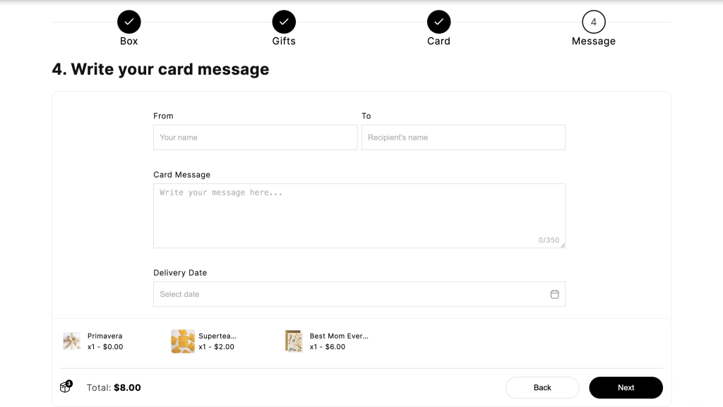
* A **text area** for customers to write a card message or leave order notes
* A **text box** for entering the receiver’s name or engraving text
* A **date picker** for selecting the delivery or pickup date
* A **file upload** for uploading reference images, logos, or design instructions
* A **number box** for providing the receiver’s phone number
This is where the **Custom Fields** feature in Easify Box Builder comes in, helping you easily add and manage custom fields on your box builder pages.
**Demo**
* Custom fields displayed within a step:
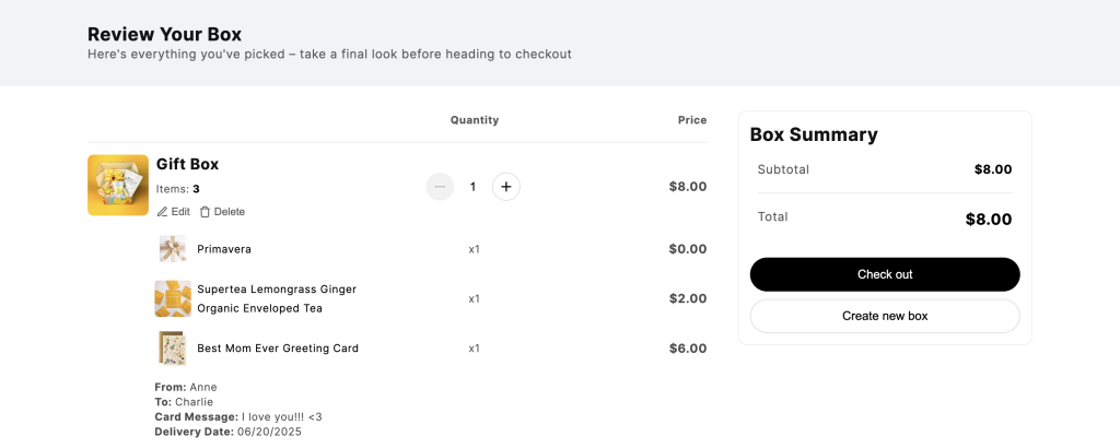
* Selected custom fields shown on the summary page:
#### Custom Field Types
Easify Box Builder offers over 12 field types you can choose from:
1. **Text Box**: A single-line text input (e.g., name, engraving, short notes)
2. **Text Area**: A multi-line input box for longer text (e.g., card message, special requests)
3. **Number Box**: Accepts numbers only (e.g., phone number, quantity)
4. **Date Picker**: Lets customers select one or multiple dates from a calendar
5. **File Upload**: Lets customers upload one or multiple files (e.g., images for custom designs, logos)
6. **Time Picker**: Allows selection of a specific time (e.g., delivery/ pickup time)
7. **Dropdown**: A dropdown list where customers can choose from preset options
8. **Checkbox**: One or multiple checkboxes to allow selection of options (e.g., “Add gift wrap”)
9. **Button**: A button list where customers can choose from preset options
10. **Radio Button**: A group of options where only one can be selected (e.g., select one style or color)
11. **Switch**: A toggle on/off switch (e.g., “Include a greeting card” yes/no)
12. **Image Swatch**: Display visual options.
## How to Set Up Custom Fields
{% stepper %}
{% step %}
### **Create your box and add step(s)**
In the **Visual Editor**, create your box and add the steps you need.
{% endstep %}
{% step %}
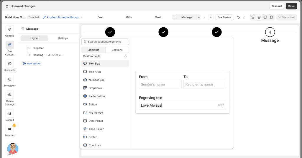
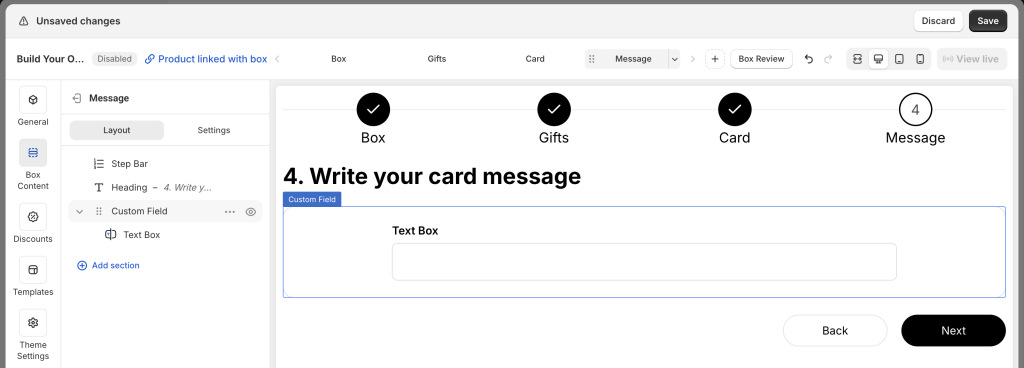
### **Add Custom Fields to a Step**
Open the step where you want the field.
Click **Add section** → scroll to **Custom fields** → select the field type (e.g., Text Box) to add it to the page layout tree.
{% endstep %}
{% step %}
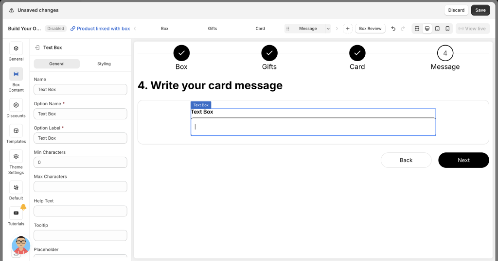
### **Edit Field Details**
***General Settings (available for all field types)***
* **Option name**: Give your field a unique name. This name will appear on the summary page for customers and in the Shopify admin under order details. Make sure each field in the box has a distinct name to avoid confusion.
* **Option label**: Add the label that will be shown to customers on the step page. Labels can be the same or different across fields — it’s up to you.
* **Placeholder**: For text fields, placeholders provide a helpful hint or example inside the field (e.g., “Enter your text…”). For dropdowns, date pickers, and others, it might be something like “Select option”, “Please select”, or “Select date”. The placeholder disappears once the customer starts typing or making a selection.
* **Tooltip**: Add an informative tooltip that appears when customers hover over the small question mark icon, offering extra guidance or context.
* **Help text**: Provide additional instructions or clarifications that show up below the field, giving customers more details if needed.
* **Column width**: Adjust the width of the field by choosing from 25%, 33%, 50%, 66%, 75%, or 100%. For example, 2 fields set at 50% will fit side by side on the same row. You can also mix widths, like combining a long 75% field with a short 25% field to create a balanced layout.
* **Required**: Make the field mandatory, ensuring customers can’t move forward without providing the necessary input.
***Field-Specific Setting*****s**
**Text Box / Text Area**\
▸ *Min characters* – Set the minimum number of characters required (leave blank for no limit).\
▸ *Max characters* – Set the maximum allowed characters (leave blank for no limit).\
▸ Character count – If Max characters is set, a character counter will appear in the input box.
**Number Box**\
▸ *Min value* – The lowest number customers can enter (leave blank for no limit).\
▸ *Max value* – The highest number allowed (leave blank for no limit).
**Date Picker**\
▸ *Date format* – Define how the date appears (e.g., DD/MM/YYYY).\
▸ *Multiple selection* – Allow customers to pick more than one date if enabled.
{% endstep %}
{% step %}
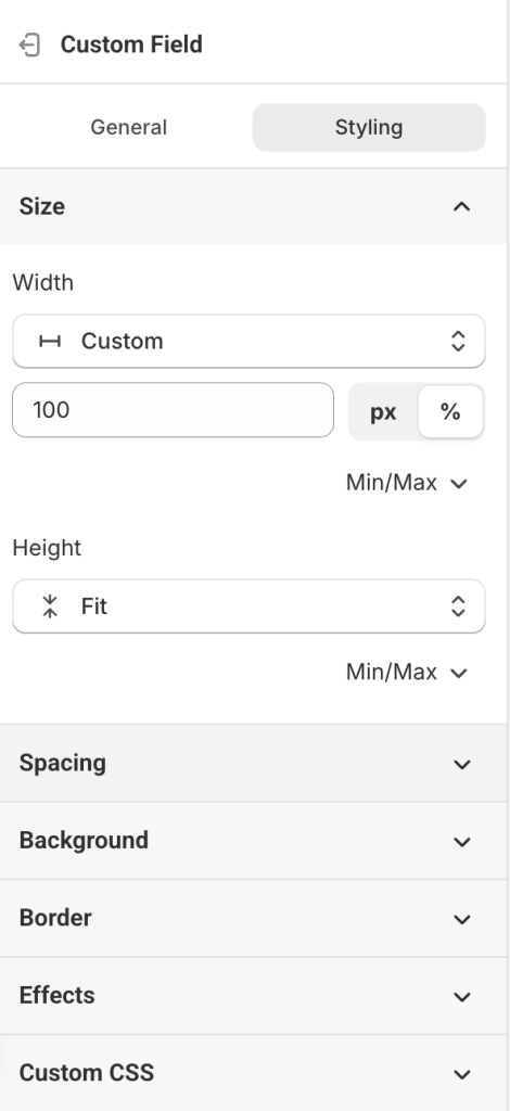
### **Style the Custom Field Section**
In the page layout tree, click **Custom Field**.
Go to the **Styling** tab to adjust size, spacing, background, border, effects, or add custom CSS.
{% endstep %}
{% step %}
### **Save and Preview**
Once you’ve added and styled your fields, **save the box** and check how it looks on your storefront.
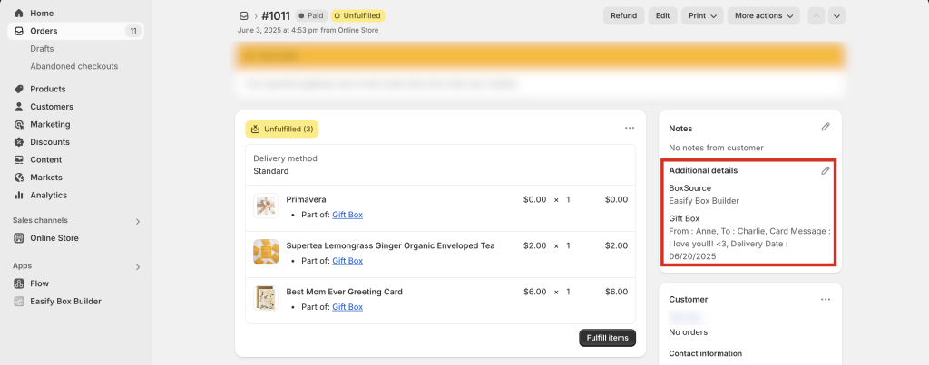
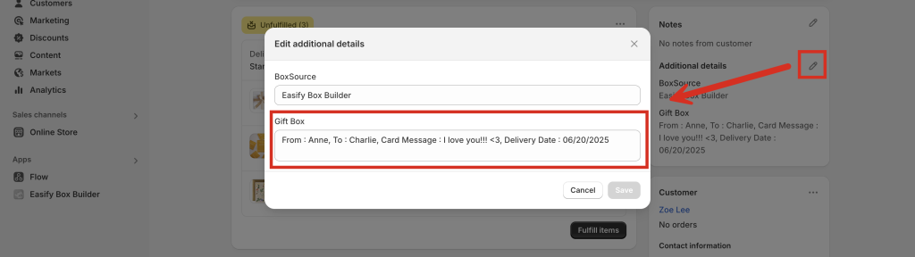
#### Viewing Custom Field Data in Orders
All custom field selections will appear in the **Additional details** section of each order in your Shopify admin.
If you export orders using Shopify’s standard export function, custom field data will be included in the export file.
{% endstep %}
{% endstepper %}
## Need Help?
If you run into any issues or have questions, feel free to reach out via our **in-app 24/7 live chat**. We’re always here to help!
---
# Agent Instructions
This documentation is published with GitBook. GitBook is the documentation platform designed so that both humans and AI agents can read, navigate, and reason over technical content effectively. Learn more at gitbook.com.
## Querying This Documentation
If you need additional information that is not directly available in this page, you can query the documentation dynamically by asking a question.
Perform an HTTP GET request on the current page URL with the `ask` query parameter:
```
GET https://easify.gitbook.io/easify-box-bundle-builder-docs/user-guide/visual-editor/create-custom-fields-options.md?ask=
```
The question should be specific, self-contained, and written in natural language.
The response will contain a direct answer to the question and relevant excerpts and sources from the documentation.
Use this mechanism when the answer is not explicitly present in the current page, you need clarification or additional context, or you want to retrieve related documentation sections.