> For the complete documentation index, see [llms.txt](https://easify.gitbook.io/easify-box-bundle-builder-docs/llms.txt). Markdown versions of documentation pages are available by appending `.md` to page URLs; this page is available as [Markdown](https://easify.gitbook.io/easify-box-bundle-builder-docs/sales-lab/first-sale-cheat-sheet/check-box-responsiveness-on-every-device.md).
# Check Box Responsiveness on Every Device
Your customers will visit your box page from phones, tablets, laptops, desktops and different browsers. If your box looks broken on any of them, they’ll leave before placing that first order.
That’s why checking responsiveness isn’t optional — it’s essential.
**🎯 Why this helps you get that first order**
A box that looks great on every device builds trust. When a customer can easily browse and build on their phone or laptop without glitches, they’re far more likely to complete that first purchase.
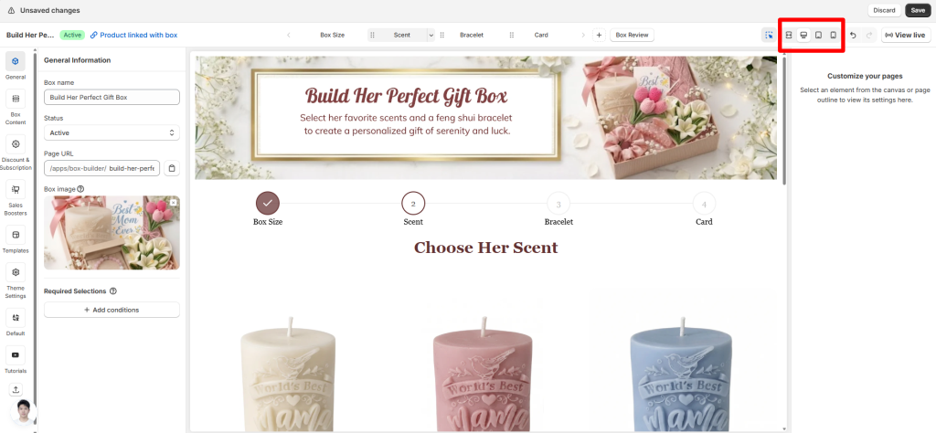
## How to Check Responsiveness of The Box
{% stepper %}
{% step %}
### Step 1: Use the device switcher
In the top-right corner of the Visual Editor, you’ll see the view mode switcher with icons for Fullscreen, Desktop, Tablet, and Mobile.
Click each one to see how your box page will look on different screen sizes.
{% endstep %}
{% step %}
### Step 2: Test on real devices
The preview is helpful, but it’s not perfect. Always open your live box page on an actual phone, tablet, and computer to see how it really behaves. Tap buttons, scroll through steps, and try building a box on each device
{% endstep %}
{% endstepper %}
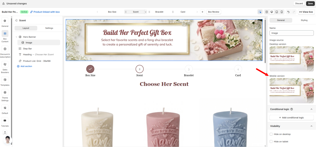
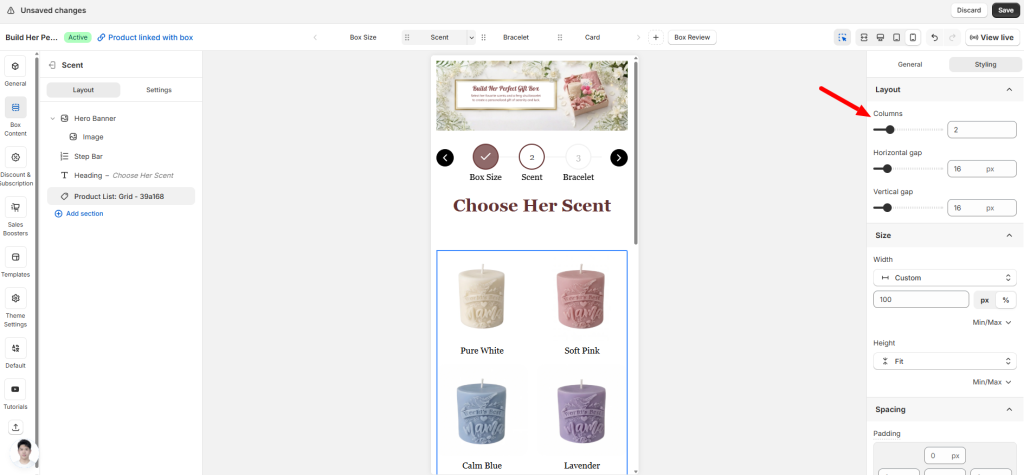
## Device-Specific Settings You Should Know
For some elements, you can adjust how they appear on mobile without even switching to mobile preview. Just look for device-specific settings right in the General or Styling tab.
For example:
* **Banner** – There’s often a separate field for mobile banner image. Upload a different image for mobile without touching the desktop version.
* **Product** – Preview on Mobile using the device switcher, then set the number of columns (e.g., 2 columns instead of 3). The change applies only to mobile.
Other elements like text blocks, buttons, or custom fields can also be shown or hidden.
Once you’ve confirmed your box looks great on every device, don’t stop there. The next step is making sure everything works correctly — prices, discounts, stock counts, and more. A beautiful box page means nothing if the numbers are wrong.
Next up: [***“Check Box Page Accuracy (Prices, Discounts, Stock)**“*](broken://pages/CUlvjSf8oyCHfvw7v8JM)
## Need assistance?
If you notice something looks off on a specific device and can’t fix it, just click the live chat in the bottom-left corner. We’re here to help.
---
# Agent Instructions
This documentation is published with GitBook. GitBook is the documentation platform designed so that both humans and AI agents can read, navigate, and reason over technical content effectively. Learn more at gitbook.com.
## Querying This Documentation
If you need additional information that is not directly available in this page, you can query the documentation dynamically by asking a question.
Perform an HTTP GET request on the current page URL with the `ask` query parameter:
```
GET https://easify.gitbook.io/easify-box-bundle-builder-docs/sales-lab/first-sale-cheat-sheet/check-box-responsiveness-on-every-device.md?ask=
```
The question should be specific, self-contained, and written in natural language.
The response will contain a direct answer to the question and relevant excerpts and sources from the documentation.
Use this mechanism when the answer is not explicitly present in the current page, you need clarification or additional context, or you want to retrieve related documentation sections.